Fraktur:
type & conflict
Research, type design
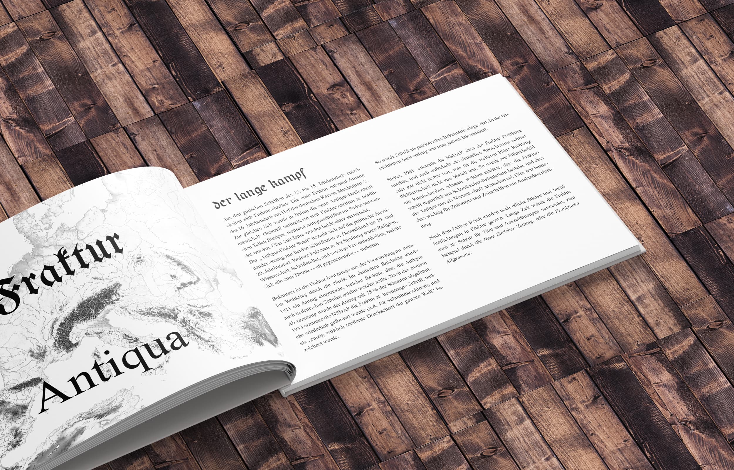
My interest to develop a Fraktur font sparked because this specific group of typefaces is historically and politically charged to a noteworthy degree. Fraktur has remained cause or part of large and small conflicts and divides in Europe since its creation in the 16th century.
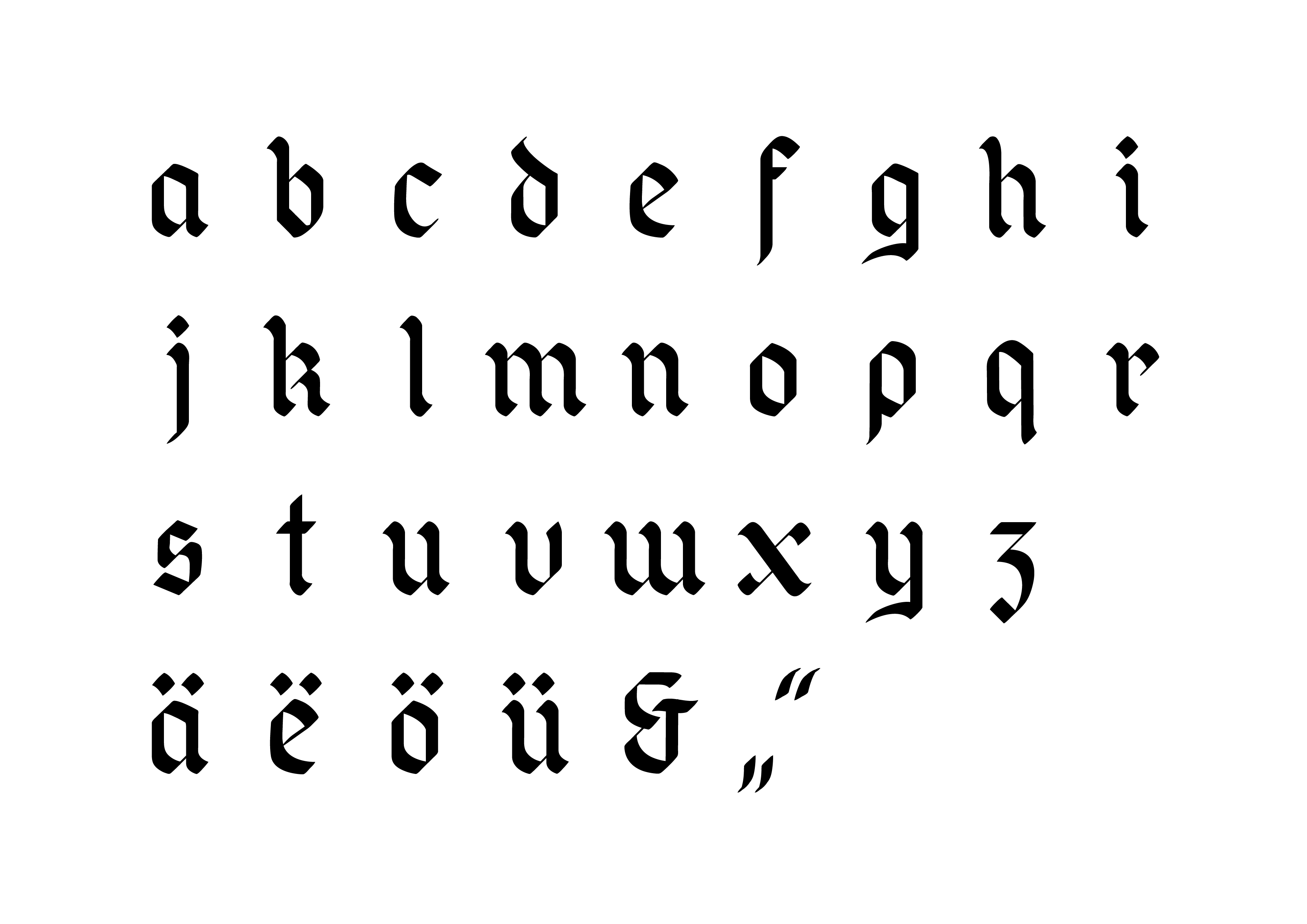
Guided by type designer Albert Kapr's work about the form and history of blackletter fonts, I set out to translate my personal handwriting into a blackletter font. Using an ink dip pen I developed the forms of the individual letters. To increase legibility, I decided to modernise the x, use a one-story a, and avoid the typical long s that most readers nowadays have difficulty identifying.
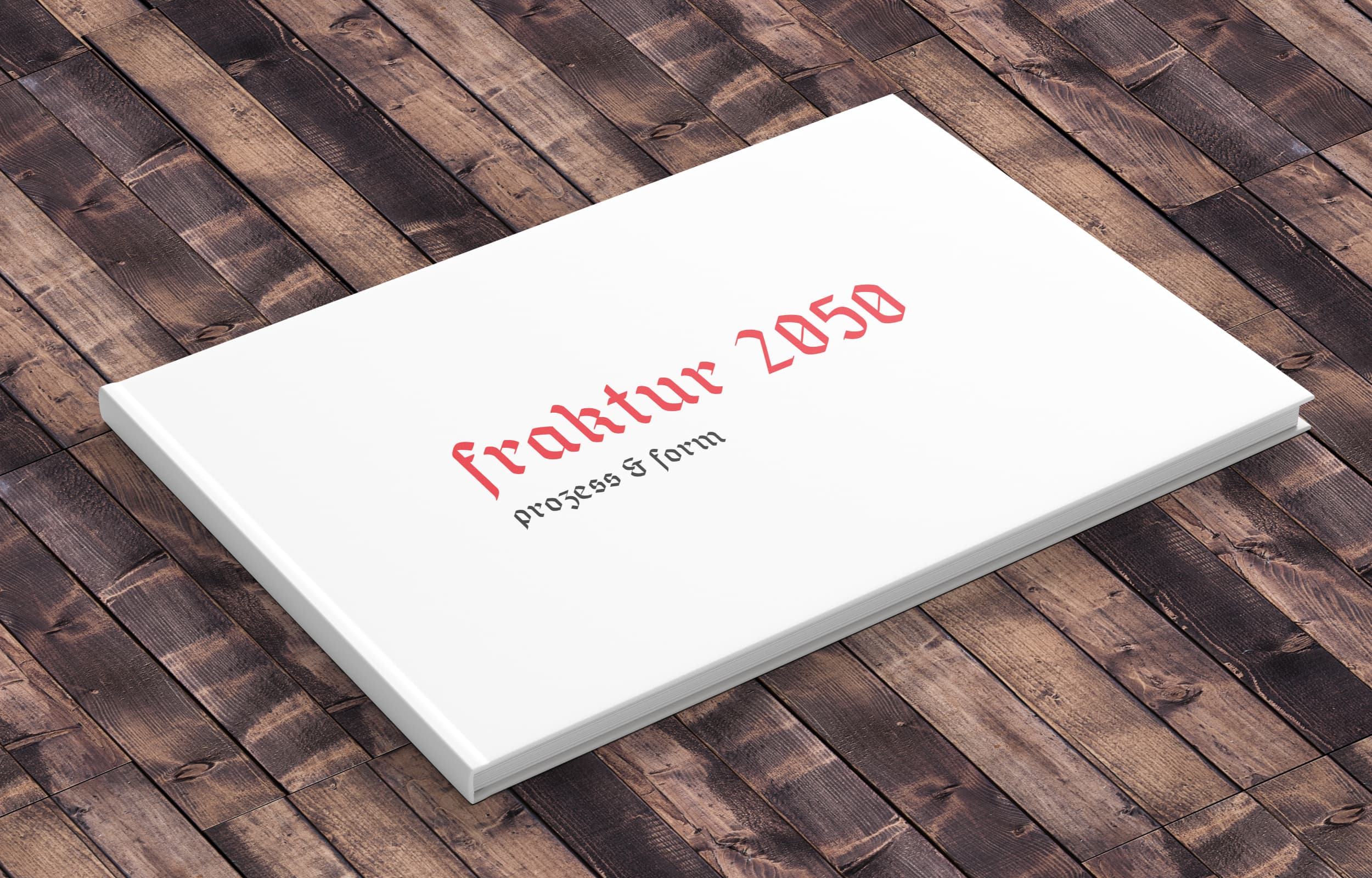
The accompanying type specimen gives insight into the exciting history of Fraktur fonts, and explores their modern significance and application.
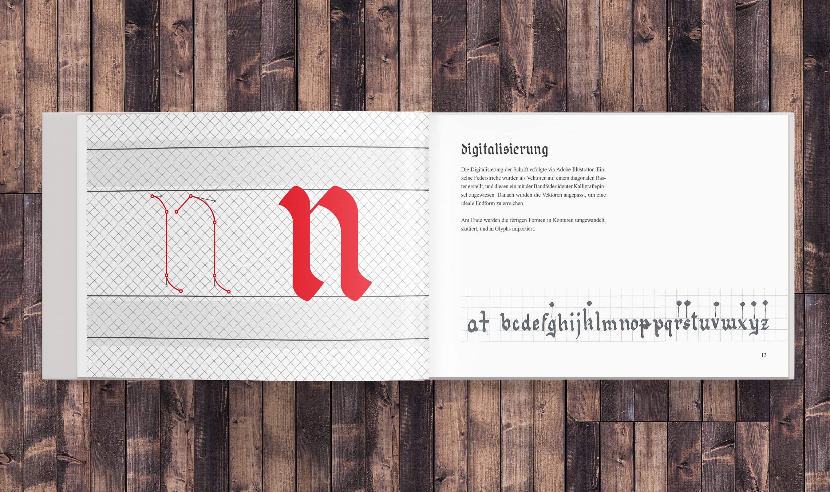
Fraktur is originally a calligraphic hand. I started developing the form of the font using a dip pen and ink.


The name Fraktur 2050 is inspired by the EU's Energy Roadmap 2050; in this context a symbol of solidarity and progress to contrast historic divides and conflicts within Europe in which Fraktur played a part.
The poster says: “mehr Europa! Energiewende”; engl.: more Europe! energy transition
Superior audio
UX design &
theme development
previous

Discussing trade
Research
UX & Facilitation
next